Showing posts with label Crit. Show all posts

Wednesday, 5 December 2012

Final Crit

Feeling positive today I had a lot of final products compared to some and I'm happy with my position. I am photographing all my work today, and i just need to fix one design for all of my boards instead of trying to recreate the brief in each set of boards. I have at least one thing to propose for each brief... so this work is very do-able and hopefully stress free.
 Feedback
The final crit today

I created by boards all to reflect the individual briefs, but after the crit and seeing everyone else boards it was easy to see that the individuality of the brief is lost with the design of the boards. I decided to re-design them to create a brand for myself and submission.
I hope this makes my work look more unified.

Tuesday, 13 November 2012

13th Crit with Andy

I knew I wanted to speak to Andy again because he knows what I am doing, and that saves time. I wanted to ask him mainly about my Taxidermy brief. 
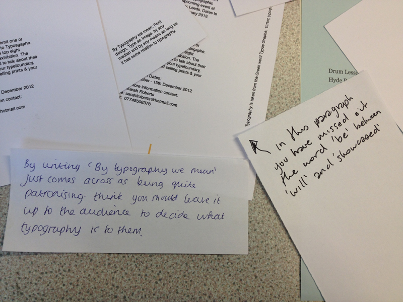
He gave me some great advice about how to polish up my typography skills and layout. His feedback sheet is below. I need to look at widowing and get rid of it. He sugests that when I have finished all the pages go over them again one after the other to make sure the type is consistant and the double spread look right together.

For Dan's brief we spoke about the neon posters. He says the type is very reserved and should be louder for a poster. I will play around more with these. As for the business cards he agrees that the logo is strong, so I should focus on that. I have decided to use the lazer cutter, with is something I will show Dan and get his feedback.

Typos: meeting with Steph on the 16th to start publication.
Leeds Market: need to pick colour palette. Make map first! (I think for me this is the easiest part).

Thursday, 8 November 2012

The crit and the feedback

In the main crit I don't think the small feedback was helpful, as people where just commenting on colour. I got 3 large feedback sheets. The most important part of the crit for me was the meeting afterwards. We got into a group of 6 people and talked through our work. I spoke about Daniel Chappell branding, about the colours I should use (neon) and Nial suggested using lazer cut for the business cards. Something that people keep commenting on is the strength of Dan's drum logo. I want to make this the focal point of his band. We also spoke about Taxidermy and basically I just need to carry on with it.

Wednesday, 24 October 2012

The crit: 24th Oct 2012

The crit was today, I feel like the whole morning I had a bit of mixed feedback. I feel like for half of the crit I needed to explain my work and what I was doing ans where I as up to. And the other time I felt that people didn't understand what I wanted to create... because I wrote it all on my blog, I have a lot of posts to look through. I also saw a lot of people spend a lot of time staring at my taxidermy research, which was nice to see people interested... but it took them a while.
I would have much preferred to be given a couple of minutes to talk through my work then people could crit it.


Feedback here.

Thursday, 18 October 2012

18th Oct feedback

DanC
. Look at interesting photography styles, LCM promotion
. Interesting editing, or just use simple still shots with a good show of depth and field.

Taxidermy
newspaperclub : printing Taxidermy into a newspaper format. Running with the free budgeted idea.

Leeds Market
. Look into using the illustration as way finding: explore everywhere where it could be.
. Continue making the illustration
. When you have created them look are where else they could be applied... sell them as tote bags / screen printing posters / use them as promotion for Leeds Market.
. Merchandise: bags / badges / tags.
. Wayfinding :comedy carpet

Steph Collab
. Showing Andy the promotion posters he says he prefers this one which was my favourite too. He said he likes the concept of the timeline ans the type and layout, it looks more considered than the print outs we chose.
. I cannot change the ones we printed because it was a compromise, but I will make sure I explore the timeline style of my individual mail outs to type foundries.
Andy's feedback sheet

Above is a list of what I want to do within each project, showing what I have completed, what I am doing now and what I still need to do. This is pretty scary.

Tuesday, 9 October 2012

9th Oct: Talking with Andy

After having my group critique with Fred I thought it would be best to try and clarify things in my head by speaking to Andy, as no one else was speaking to him I took the time to speak to him about my Taxidermy brief and where I wanted it to go.

Taxidermy
Expand this beyond just on publication, always think about how everything can link into each other. (core treated in the same way)

Could it be a boxset of Taxidermy publications, packaged and aimed to collect to keep?
Is it to educate, to have a nice bit of information to keep?
Or is the concept in someway to pass around the information so a lot of people read the same copy?
Is it about interviewing taxidermists or people who know about it?

How would that be designed?
Is it creating a format so all the other issues will follow the same structure?
Or is it about producing different designs for each character being interviewed?
Is it about creating different looks for each issue and it's the topic that combine them?
Could be a reference to taxidermy old books?

What is the content?
A brief history, focusing on interviews?
Focusing on educating a audience and reaching as many people as possible, so the trade never dies?
Is it promoting trades in general? 
Or is it a nice bit of design and print seen as a collectable?


I need to think what I want to get out of this.

I need to list the other trades so I can figure out what sort of design I want to create and the concept I want to expand upon. 

Steph Collab
Could bring talks in to create a community and events, linking the industry to the exhibition. 

Look at Type foundries to counteract the type as image proposed exhibited work, maybe the exhibition is all about contemporary typography, as image and new designed and created typefaces.

Look as smaller type foundries - Lost Type.

Maybe predict the 6 favourite future fonts, people will already know about past fonts.
Create a atmosphere, a discussion. This is much more interesting.

Maybe get submissions for type and image and typefaces. People can vote online and the top ten are showed in the exhibition, advertised and promoted in the exhibition publication.
This will involve a website and a app.
Getting people involved more.

Still focused on the journey of Type, but the exhibition is all about the present.

Leeds Market
Celebrate cultures and Leeds. 

Love at Live it Love it, Leeds. Businesses can brand themselves for free with this. Paid by the government. Way finding - Colour coding around the market, adding order to chaos.

Propose the website.

Look at individual trades and the range. 
Look at how cities brand themselves (London). Communities and societies

Look at Sumo (Leeds Art Gallery)

Daniel Chappell
How can you intemperate drums to promote dan? use a flash to create a video. (Simian Mobile, Kate Moross) 

Logo design, how can it be applied, not just a logo, but the whole brand.
interview (video), combine that with drumming.

How do you profile Dan, if he a drummer? a band member? or a teacher?

Monday, 8 October 2012

Progress crit: 9/10/12


Fred's feedback


. Daniel Chappell: too much to do film and web, I need to work with existing content or use art direction to collaborate with someone who can film. 
. Ask Jonathan Duffin

. Collab Steph: we will never have enough submissions for the event, in time for the exhibition in Nov / Dec. We need to propose the exhibition or have it with found submissions, by friends and people we know.

. With every collaboration and live brief we need to keep a eye on timescale. We should have a brief on the back burner in case it all goes horribly wrong.

. Type, instead of doing the Taxidermy brief and creating a typeface for it, that is too much work. So have a playful brief on the side of creating five different typefaces and produce posters, etc

. Taxidermy could exist as a gardian pull out. Not just one book, expand into different covers and topics. Learn a new trade as a brand.

. Don't repeat briefs, don't make 4 websites. Have a variety.

. Have a play brief that is just about doing.

Thursday, 4 October 2012

4th Oct re-written


I've just tweaked them a little bit more adding extra information. I'm also printing these put to put them in my folder, which is defiantly helping me to to remain on target and organised.

Wednesday, 3 October 2012

Fred's Session: re-writing and edition the wants and needs.

Listing for each of our significant briefs:
. the Skills we would use / develop
. the Contexts of the design work (educational, publication, etc) 
. the Content of the brief intended
. the Products proposed/ possible.

This at first seemed a bit as a given, but the more you write and process each brief you start to add things and realise what is possible and why I liked a certain brief more.

Learn a new trade: Taxidermy
Skills
Research
Writing content, putting it together (journalism & editing)
Type-layout
Type-font making
Photographs (limited) 

Contexts
Educational
publication
History / factual

Content
Experimental type and layout, expressing words through layout
minimal photos
not biased
interviews
museums
taxidermists

Products
Publication, B&W cheap to print and bind
Web?
..... Collab(Steph) ISTD: Type Factory
Skills
layout, publication, grid
branding
logo design
organisation
typography
networking
pricing up work as printed professionally

Contexts
Exhibition
publication
promotion of the exhibition

Content
History of type, journey from the beginning till now
Hand-drawn type
Font making
Screen printing
Letterpress
Book-binding
Work submitted from students and professionals

Product
promotion (posters, massive A2 pasted around town, fliers) & Social media
publication of work in exhibition include the journey of type
Web

Photographs of examples done in class...

Tuesday, 2 October 2012

3rd October Crit: Seven Briefs


This took a long time.
Now I feel I have a direction with each brief, it has also helped me to be more specific about why I want to do each brief and the skills I wish to develop and focus upon.
I feel every brief I have chosen is different to the next but most importantly all have my style attached.
Now I'm excited to get started and to complete these briefs!

I many not be able to do everything I have proposed but I will be organised and try my best. I feel this year I am very settled compared to my pervious years on the course. I felt like I was constantly playing catch up to try and further my software skills. 
Over summer I feel like I finally know my direction within Graphic Design and I am a more surer person. I think my placements and interviewed helped me with my confidence, which has given me the nudge to actually do it!