Showing posts with label CollabSteph. Show all posts

Wednesday, 12 December 2012

Finals OUGD301

Finalised Briefs and Final Boards


Brief 1: Branding Daniel Chappell

Brief 2: Learn a New Trade: Taxidermy

Brief 3: Leeds Market Re-brand and Way Finding

Brief 4: Plan UK - YCN 'Because I Am A Girl' Campaign


Brief 5: Typosgraphe - Collaboration

Additional Briefs
Brief 6: Prospectus Concept Pitch

Brief 7: MHG Filming

Tuesday, 11 December 2012

Board Covers

I wanted to create A3 covers. 
So I designed them to be relevant to the brief .., After printing I realised that it has completely separated all of my boards and made them look like they don't belong together. So I am going to print some simple ones uses the same typefaces and layout as my submissions forms and boards. 
I must remind myself that over complicating things just looks messy.
Below is a pdf of what I printed:


Here are my new improved ones:

A lot better and much more neutral. It works well with my CD case and I love the natural feel of stock. The sizes are A5 folded so a buldog clip can group the boards.

Tomorrow I will print A6 versions to group together my print hand ins. I will also make a band to fasten around my Timeline Typosgraphe Poster.

I am very happy with my branding and know they look way more professional than my original ideas. I am trying to be more organised.

Printed all of my boards!


Thursday, 6 December 2012

Wednesday, 5 December 2012

Photographing everything for my boards

I booked out Studio B last week for today from 4:30-9pm. Since having the photography induction I know I need to document my final outcomes a lot better. Every placement I have been on they have always said students websites are very impressive when they have good photography and a theme. 

I rented one Digital SLR, 2 lights, 2 stands and 2 cables. I also used a large table for taking photographs on. One of the photography staff helped me set up the camera, but they left at 5pm. Every time I moves the camera I had to adjust the ISO or Apiture, Lisa had also warned me that all of her photographs turned out blurred when she put them onto her mac, because the quality of the view on the camera is bad, you cannot tell. Due to his I stared taking photographs with my iphone... and my SLR photographs are mostly blurred and my iphone photos look great. Very very glad I used my iphone, the only problem is on about 25 out of 264 images have different temperature of colour.


SLR photographs (the good ones)


Taxidermy


Typosgraphe


Dan C


Leeds Market


Because I am a girl


This took ages to upload! so many photographs. Going to add them to my boards now and change the type and layout so it creates a brand.

Final Crit

Feeling positive today I had a lot of final products compared to some and I'm happy with my position. I am photographing all my work today, and i just need to fix one design for all of my boards instead of trying to recreate the brief in each set of boards. I have at least one thing to propose for each brief... so this work is very do-able and hopefully stress free.
 Feedback
The final crit today

I created by boards all to reflect the individual briefs, but after the crit and seeing everyone else boards it was easy to see that the individuality of the brief is lost with the design of the boards. I decided to re-design them to create a brand for myself and submission.
I hope this makes my work look more unified.

Boards ready for the crit

Because I am a Girl: Plan UK


Leeds Market


Taxidermy


Typosgraphe

These are my boards so far, ready for the final crit, I know they're not great but it was more of a case of mapping out the content and writing than making them look good. I have decided to reflect the brief ithin the boards. I thought it was a nice touch.

Thursday, 29 November 2012

Typosgraphe

Spoke to Steph today and Typosgraphe is very nearly finished!
We wanted to do the info graphics and way-finding, but we don't have a mass amount of submissions.
I sent a email to all students, hopefully we get some stuff soon.


Tuesday, 27 November 2012

Reading through the briefs again


Steph spoke to me today and said she had o do another brief. Typosgraphe was my competition brief and these apparently doesn't count as one, because it cannot be submitted. Which means I have to do another brief, which means I have no time at all! 
Hopefully going to screen print tomorrow after the crit. 
Things I have to do:
screen print: Taxidermy poster, Dan's business cards, Leeds Market bags and wrapping.
Dan's drumstick pencils. 
Dan's posters.
Design 2 covers for the taxidermy brief, propose more posters 
Leeds Market history posters - stamp

New competition brief
ALL OF MY BOARDS
I have booked out next wednesday night in a big photography studio so I will have lovely photographs.

Typos: 
cut business cards,
way-finding,
boards

Taxidermy:
x2 covers
sp poster
make real... printing costs, where would it exist?
boards

DanC:
sp buisness cards
print posters
lazer cut drumstick pencil
boards

LeedsMarket:
sp / print branding
history poster
tote bag, mock up
price up everything
boards

Live Competition brief: start


Screenprinted TyposGraphe


Monday, 26 November 2012

printing with James

Getting the the files to print was a nightmare.
Timeline poster


I knew there was another process you had to do before screen printing to your images. I just couldn't remember what it was. All of the youtube tutorials were talking about how to print images. So when I went into university I spoke to Mike and he explained what to do. The whole morning was a rush. Below are the settings I applied
The effect you have to apply is halftone. The frequency depends how many dota you see: 65 is quite high. 75 is the maximum you must go, this gives you fewer dots but looses tone. Mike suggested 65 as this will have more visible dots, but shows more tone. The outcome is different on each image, because all of mine are from the internet they are as varied as they ever would be.

Mike also showed me to save as a post script file which is great for screen print negatives as it divides all the colour onto different print outs. This took ages to work as well. My print slot was 11am. I had to leave this over lunch for James to print.

Leeds Market
I didn't have time to print onto different stocks or do a test color print, but I like the outcome anyways, going to print more tomorrow.


Taxidermy Poster
James had stock prosaically for screen printing negatives. I printing the taxidermy and timeline poster on this. a2, it's big but looks good.


Saturday, 24 November 2012

Typos Graphe Screen printing plan

hanging up on the 3rd of Jan
Opening night on the 8th of Jan.

A1 timeline 
Poster A3 x handfull
black stock. White ink
Fliers A5 x a lot
Timeline in the background faint cyan. black details over the top
Info
exhibition dates
launch night
white cloth gallery: address
brief description about the event.
email http://www.leedsinspired.co.uk/about
Wayfinding 
Joe
Sophie
Inter dis: Ryan Brown
Gabbi
Me
Chirs Van
Flanagan
Steph

Boards
#1 brand guidelines: logo, colours, buisnes cards
#2 promotion: college and mailouts
#3 proposed website
#4 exhibition: promotional material


I started by creating a tiff files of our logo so it was the same proportions in each design. I designed the a5 flier and Steph designed the A3 poster. We did them in the sane round and together so they had the same look and style. My fliers will be screen printed. All of the text will be black. The background of the fliers will be a lightly printed cyan of the timeline poster. The stock will be off white or grey.


The Timeline Poster
Originally Steph was going to do the Timeline Poster and I was going to do the Web Site Design. I have done first ideas of the website, and this below is Steph timeline poster. She said she wanted me to do the poster as it is very type and layout, something that is more my strength. I was going to make both but since Steph has nothing else to do for Typosgraphe it seemed fair to completely swap. 
  Here's my document set up.
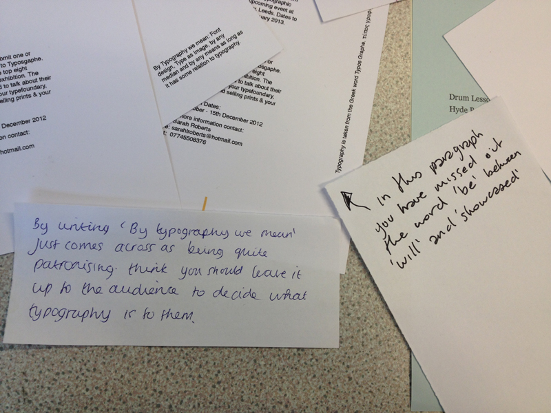
It took a lot longer than I expected to gather all of the images I wanted. Steph gave me  a folder with all the images she had, but I didn't want images of the typefaces, because they will be around the boarder of the A1 poster. I wanted photographs of the designers of the typefaces. Some of these images will be black and other will be screen printed using cyan. I monotoned all the images and tried to make them the same contrast. 


I started with 12/16 types Gotham Book, but I soon realised this wouldn't fit. I was using a 8pt baseline grid along with my columns. I then changed to 10/13pt with a 6.5 baseline grid.


I really like the staggered images, it works as a timeline, but isn't too boring and straight line. I didn't use some of the images as there wasn't enough space. At the end of placing all of the information out, I had one column free which meant I could shift elements around to get a more spaced out layout.

I now just need to source a lot of old style typefaces to place on top and underneath the timeline. I am very happy with what I have done and I can't wait to screen print.
Very excited to Screen Print.


BCE (Before Common Era) = BC
CE (Common Era) = AD

Friday, 16 November 2012

What I have to do?

Friday
Finish Dan's promotional posters Fri and Saturday. Print. Post.
Dan's Buisness Cards

Saturday
Leeds Market finish images. (finished A5 cards) create a brand. typefaces. 
Start the A3 map

Sunday
Filming with MHG all day

Next week......
Dissertation for wed, write another 2000 words.

What is left?

Typos
.Speaking with Steph about Typos Graphe
.no publication
.type timeline
.way finding
.promotion of the exhibition
.get submissions - icons for the name tags, etc

Leeds Market

.Near have the map finished
.Promotional posters for Leeds Market
.Promotional 
.Work on a quick rebrand of the website. Not to discard their own work, but add to it.
. apply illustrations to a market store and use it to package.

Taxidermy
.Other front covers
.Posters

Dan
.Promotional posters, different formats
.Code website
.Drumstick Pencils


Tuesday, 13 November 2012

13th Crit with Andy

I knew I wanted to speak to Andy again because he knows what I am doing, and that saves time. I wanted to ask him mainly about my Taxidermy brief. 
He gave me some great advice about how to polish up my typography skills and layout. His feedback sheet is below. I need to look at widowing and get rid of it. He sugests that when I have finished all the pages go over them again one after the other to make sure the type is consistant and the double spread look right together.

For Dan's brief we spoke about the neon posters. He says the type is very reserved and should be louder for a poster. I will play around more with these. As for the business cards he agrees that the logo is strong, so I should focus on that. I have decided to use the lazer cutter, with is something I will show Dan and get his feedback.

Typos: meeting with Steph on the 16th to start publication.
Leeds Market: need to pick colour palette. Make map first! (I think for me this is the easiest part).

Thursday, 8 November 2012

The crit and the feedback

In the main crit I don't think the small feedback was helpful, as people where just commenting on colour. I got 3 large feedback sheets. The most important part of the crit for me was the meeting afterwards. We got into a group of 6 people and talked through our work. I spoke about Daniel Chappell branding, about the colours I should use (neon) and Nial suggested using lazer cut for the business cards. Something that people keep commenting on is the strength of Dan's drum logo. I want to make this the focal point of his band. We also spoke about Taxidermy and basically I just need to carry on with it.